Need training at your office? Request a quote for custom training.
Adobe InDesign: Working with Spaces
By Barb Binder, Adobe Certified Instructor on InDesign
Updated Jan 7, 2025
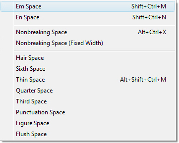
When most of us think of spaces, we think of hitting the spacebar, and moving on. Did you know that InDesign supports additional spaces? Ok, lots of them? Sometimes I have to suppress a giggle when I direct my students to the Insert White Space options—somebody will always gasp when they see the long list! Have you seen it yet? Open up the Type menu and select Insert White Space:

Before we cover all of those options, how about if we just discuss the spacebar for a moment? The spacebar is used to separate the words within a sentence. Spacebar spaces are proportional, and can expand and contract as type is set to full justification (that’s how InDesign gets each line to start at the right margin and end at the left margin). Contrary to what you were taught, good design calls for one (just one!) space between sentences and after punctuation. If this is news to you, please go read Adobe InDesign: Removing Unwanted Spaces, Fast!
Meanwhile, back to the list. Most of these are fixed width spaces, that do not expand or contract their width when a paragraph is justified. In the first group, their width is based on an em space.
- Em space. The em space is typically the width of a capital letter M in any given typeface. In InDesign, if your type is set to 12 points, the em space is 12 points wide. I use them when I want a big fat space and I don’t feel like setting a tab. In the first image below, the run-in head is separated by a spacebar space. In the second image, it’s an em space, which is significantly wider and will always have the same width:


- En space. Half the width of an em space. For example, 12 point type has a 6 point en space. I use them when I want a fixed space and I don’t feel like setting a tab. In the image below, the run-in head is separated by an en space.

- Thin space. One‑eighth the width of an em space. For 12 point type, that’s 1.5 points My personal preference is to space out my em dashes with thin spaces on both sides. The first image below shows em dashes without any spacing around them, the second image shows thin spaces on either side. This is a preference—it most important to be consistent with how you handle the em dashes.


- Third space. One‑third the width of an em space.
- Quarter space. One‑fourth the width of an em space.
- Sixth space. One‑sixth the width of an em space.
- Hair space. One‑twenty‑fourth the width of an em space.
The next two can be useful in tables, especially when you don’t want to have to set tab stops to line up the columns:
- Punctuation space. Same width as an exclamation point, period, or colon in the typeface.
- Figure space. Same width as a number in the typeface. This one is really handy for scooting the numbers in a table over so that the varying columns line up on the right hand side, when I don’t feel like setting a tab. In both imags, the cells all have center alignment. In the first image, the first two cells have few digits than the rest, and the center alignment is apparent. In the second image, I inserted a figure space at the beginning of the first two cells, and everything lines up perfectly.


The next two are non-breaking spaces. They both keep two words together on a line, so for better word spacing, I’d advise you to use the newer, proportional non-breaking space for normal paragraphs:
- Nonbreaking space. The same proportionable width as pressing the spacebar, but keeps two words together on the same line. In the first image, the number 6 is all alone on the last line. In the second image, a non-breaking space was added between May and the number 6, so now they both move to the next line together.


- Fixed Width Nonbreaking space. A fixed width space also prevents the line from being broken at the space character, but does not expand or compress in justified text.
Saving the best for last, the flush space is the coolest cat in the spacing crowd:
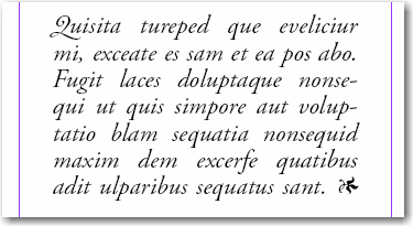
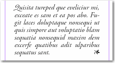
- Flush space. Adds a variable amount of space to the last line of a fully justified paragraph. Take a look at the loosely spaced words in the first image below. This is InDesign’s best effort to achieve full justification on every line. Now take a look at the second image, the spacebar space preceding the ornament was removed, and replaced with a flush space. This allows InDesign to allot all the extra space to the last line, resulting in significantly better spacing on the entire paragraph.


Thanks for writing this article. Never knew about these InDesign options. Much appreciated.
Merci…
Cela a précisé quelques points sur lesquels j’hésitais!
Je vous en pris, Guy.
Very nice.
It seems that Shift-Tab would achieve the same result as a Flush Space, but might be a bit more flexible in that it works with all sorts of justification (except perhaps Flush-Right or Centered).
Is there a time when one would be better than the other?
Hi Bob: You hit on the key element here—it’s the alignment. Shift+Tab works with any alignment, the Flush Space only works with paragraphs that are set to Justify All Lines (although Align Right would naturally push it to the far right as well). If the reason you are using it is to signal the end of a story, as in the example above, I think Shift+Tab is a better choice because you would not need to create a new paragraph style for the final paragraph, or add a paragraph override.
Another place I typically use Shift+Tab is for running heads, when I need text that is set to both the left and the right on the same line. For example, on a right page, the chapter title might be on the left, and the page number is on the right.
~Barb