Need training at your office? Request a quote for custom training.
Adobe InDesign: Tracking and Kerning
by Barb Binder
When I ask my InDesign students to define the words “tracking” and “kerning”, the best I usually get is a vague reference to letter spacing. And that’s on a good day. More often I get furrowed brows and people suddenly fascinated by their keyboards. The terms aren’t hard to understand, and when I offer both via one keyboard shortcut, the brows relax and people are looking back up at me again. What’s the magic shortcut? Hold the Alt/Option key and start tapping the left and right arrow keys. Whether you invoke tracking or kerning depends on where your cursor is and what is or is not selected.
Tracking
By definition, tracking is the process of opening or closing the space between all the letters within a selection. If you highlight a paragraph and begin tapping the right arrow key while holding down the Alt/Option key on the keyboard, you’ll be able to see the letter spacing opening up between all the letters. If it gets too loose, just switch to the left arrow key and watch as the letters tighten back up. As you play with the tracking, glance up at the Control Panel and you can see the tracking values change with each tap on the arrow key.

Why use tracking? Sometimes, my clients look at the document and request that I open up the letter spacing for readability reasons. Personally, I tend to invoke tracking when I’m trying to squeeze just a few extra words onto a page that would otherwise require a whole page of their own. It’s not the correct way to copyfit (re-writing is what we are supposed to do), but it works. I always scrutinize the text and if I can tell that I squeezed it in, I’ll remove it and send the file back to the editor for a re-write.

Kerning
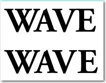
By definition, kerning is the process of adjusting the space between specific letter pairs. If you place your cursor between two letters and begin tapping the left/right arrows while holding down the Alt/Option key on the keyboard, you’ll be able to see that you are adjusting the spacing between just those two letters. As you play with the kerning, glance up at the Control Panel and you can see the kerning values change with each tap on the arrow key. The cool thing is that you don’t have to remember the difference between tracking and kerning. InDesign knows the difference, based on whether you have selection or an insertion point between two characters.

Why use kerning? When you are setting display type (think a book cover, or a poster, or any other large text that will be seen by lots of people), it’s worth it to take a few moments to even out the letter spacing. The goal is to imagine the letter spacing as vessels of water, and you want to have the same amount of water between each one. (There’s still too much “water” between the V and the E in the bottom image, but you get the idea.)

A Few Fun Facts to Remember
- For a substantial increase in the amount of kerning/tracking, add the Command key (Control on Windows) to the Alt/Option+Left/Right arrow sequence.
- To remove all kerning and tracking, make a selection and press Command+Option+Q (Control+Alt+Q on Windows).
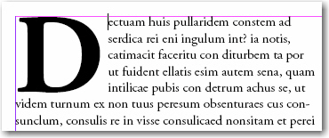
- If you are working with Drop Caps, and want to increase the distance between the drop cap and the words that wrap around it, click an insertion point in front of the first letter after the drop cap and press…you guessed it…Alt/Option+Right arrow. In the example below, the cursor is sitting right in front of the letter “e” in “ectuam”. Alt/Option+Right arrow pushes all five lines to the right of the “D”.


Nice article. Liked the image you wanted to picture for Kerning. Very informative and detailed.
Great Post! Thanks a ton for that keyboard shortcut!
Thanks, this was a wonderful article!
Great! Thanks a million!
This explains quite well. Thank you.
Do you have any recommendations as to what amount of tracking and/or kerning looks best for a font like Times New Roman, say at 12 pt? I’m thinking in terms of a volume of poetry, where I might use 16-point leading with 12 point type.
I would recommend sticking with the default settings, and not adding any additional tracking or kerning for your body text. At 12pt type, you can safely rely on the letter spacing intended by the type designer.
~Barb